Technical Analysis + Multi Objective Optimisation = Happy Si
[originally published Mar 2006]
The first thing: a link. Namely, the wiki page on the category of Technical Analysis (some back story on what the hell TA is, is here).
Short(ish) version, for the lazy (or, you know, those of you at work): TA is a way of turning largely incomprehensible charts, like this: 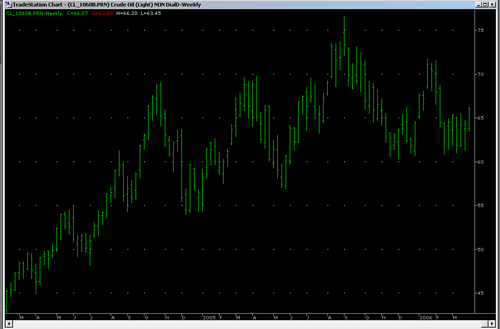
into much more informative charts, like this: 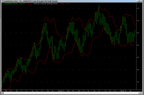
or this: 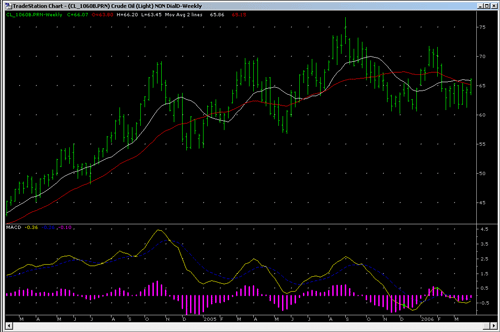
Ok, I can hear you screaming already. What the hell IS all this stuff?
The first chart. That’s light crude. Aka, oil. When people talk about the price of oil? That’s what they’re talking about [ed: uhh, to be anal, they’re generally talking about WTI – West Texas Intermediate, but this is generally number 2]. That’s a weekly chart, of the last two years. So you can see why petrol’s so damn expensive these days. Just so you know.
The second chart is called Bollinger Bands. John Bollinger was just a dude. A smart dude, but we don’t have to talk about him to get the gist of this.
Basically, Bollinger Bands tell us how much the market movement is contracting, or expanding. See how the lines kinda get closer, and then suddenly, bang! the market takes off? Yeah. That’s what Bollinger Bands are really handy for.
So, we can look at the chart and say useful things. Interesting things. Like “Hmm, light crude is going to consolidate (ie, not jump around as much) a little more, then we’re going to get a strong directional move“.
This doesn’t tell you if it’s going up or down (we’ll get to that), but it’s still handy to know. It means “keep your emergency pants ready”
The third chart is MACD. This stands for Moving Average Convergence Divergence. *yawn* yeah, exactly.
It’s a bit complicated, but here’s the basic gist: it gets a bunch of moving averages together, and measures how much they changing relative to each other.
Moving Average? Just think “average”. It’s the same thing.
wt F ? Why the hell would we bother to do this? Who cares, I mean, really?
Stay with me here, I’ll explain, then you’ll go “ohhhh!”
Some of the lines are “faster” (ie, they react quicker to changes in the data). The difference bit is where we start subtracting, say, a fast average from a slow one. What does this give us? Ahh, see, that tells us how fast the market is changing. Ie, not direction (up or down) so much, although it does tell us that too, but how quickly it’s changing direction.
So, it gives us advance warning about when the market is changing direction. Sure, you get bad warnings from time to time. These are called (amongst other things) false breakouts, or false signals. These are a big problem. We’ll get back to that later. Of course, you know, if predicting the market was easy, we’d all be billionaires. Ho Ho.
Ok, so let’s explain MACD.
At the top, to help explain, I’ve put two moving averages, a red slow one (changes slowly), and a white fast one (changes quickly).
The MACD is at the bottom and it works like this:
The yellow line is the difference between the white and red one. See how the yellow one goes down when the white and red get closer together? Yep, that’s why.
The blue line (bit hard to see) is a smoothed out version of the yellow one.
The magenta bars are the difference (stay with me here) between the yellow and blue (so when the blue and yellow cross each other, see how the magenta also crosses the zero line? Yep, that’s it).
In other words. You can look at the squiggly lines at the bottom and see direction, and changes in direction, and also how much and fast the market is moving in that direction (by how high the magenta bars are).
Oooh, that’s gotta be useful, right? right? right?
Of course, you might be saying, I can look at the chart and see that anyway. Key thing is this – you can’t see the future, so, having these lines helps clarify what might be happening soon.
So, in short, let’s say things are going up. Ok, blah blah, buy buy, etc. Wouldn’t it be useful to know when things were going to start going down, so you could, I dunno, sell, before you lost all your money? Well, MACD helps with that. Because before things start going down, they have to stop going up. Yep. a big duh right there, but it’s important. MACD helps us to see when things are slowing, and where they might be going next. Yes, false breakouts happen a lot. We’ll get to that.
So now, ooh! Useful information. We can look at the third chart and say things like (put your best boffin voice on), “Hmm, light crude is currently trending downwards, very slightly, but it’s slowing and about to change” (see the yellow line tilting up? yep, that’s how. magenta is below zero, ie, downtrend. yellow is turning up, ie, the market is maybe starting to turn).
We wouldn’t say definitively that it’s in an uptrend until the yellow line at least crosses the blue (ie, the magenta bars will be above zero), because, har har, we have to draw the line somewhere.
So. With technical analysis, we can say a much more useful thing like “Oil has been dropping, a little, but it looks like it’s about to explode in one direction, and probably upwards“.
Which, since we know that petrol prices at the pump tend to follow light crude a little slower (oil companies are big, and slow), we can say “Expect prices to go up markedly in a couple of month or so“.
See? Wasn’t that helpful? Wasn’t that fun?
So, technical analysis is pretty cool.
Even cooler than TA is the bunch of algorithms that make it up, because then you can do all sorts of interesting measurements. The above is really just a taste.
Oooh, I like algorithms. Algorithms are my happy friend.
Ok, second thing: 
ooh! I can see you’re excited already.
Ok, maybe not.
So what’s so cool about this? Ahh! I’m glad you asked.
MOO. That’s what. Multi objective optimisation (last item on the contents)
STOP YAWNING!
Let me explain. When you’re trying to solve a problem. A real problem. An interesting problem, you typically have to try and satisfy more than one criteria at once.
For example. Let’s say you want to go out with the best boy in school. What do you do?
You don’t just want someone cute. You also want someone tall. With pretty eyes. And smarts. And a good kisser. And well dressed. And so on.
Each of these is an “objective“. Goal, criteria, call it what you like.
Either way, you want to try and get as many of these as possible.
Now, if you just wanted the tallest boy, that’s easy. Line them up, walk to the end of the line. Voila.
Ditto if you just want the cutest boy. Or the boy with the prettiest eyes.
Thing is though, you want all those things. So, you might settle for, say, the boy with the second prettiest eyes, if he was also the cutest. Or perhaps the second tallest, third cutest, fourth prettiest eyes, because he was the best option.
But really, how do you know what the best option is? You weigh all these things together, in your head, and decide.
That’s what Multi Objective Optimisation is.
Except, instead of “boys in your school”, think “boys in the known universe”, and instead of 5 criteria, think, say, 50.
Any real problem. The interesting ones, the ones worth solving, are like this.
These are the problems I work on. And yes, I love it.
So, an historical view of the entire field of MOO (queue jokes now) is gonna have a whole lot of really useful information, right?
Well, it does. So, what did I learn? I learnt:
a) that I’ve more or less worked my way through all the research in the field done during the 1980’s.
remember, I’m just sitting in a room thinking this stuff up as I go along. So really, this is pretty good going. It gets better
b) I’ve also figured out some of the more successful techniques from the 90’s and 00’s.
Which is nice
c) also, there lots and lots of nifty cool interesting and successful other techniques for me to try out
All in all, a pretty damn interesting read.
So, so, so. Why the two of these together? Well, it’s like this.
What about if you got the computer to put algorithms together, with multiple objectives?
You could say things like “make me a moving average that reacts quickly, but doesn’t give me false breakouts“
or maybe “tell me which way the trend is going, but make less mistakes than MACD does“
or perhaps “tell me when the market is slowing down and about to change direction” – which is a good time to get out of a trade. Of course, the catch is, if the market slows, but then takes off in the same direction, you’ve just left a lot of money on the table. This is what us professionals call “Bad”.
With TA + MOO, anything you can dream of, anything you can think up, you could get it to do. Or at least have a damn good crack at.

Think Transformers here. Think Optimus Prime on steroids. Think infinitely flexible, infinitely expandable, infinitely connectable.
Yeah, kick ass.
So, you can see. This is pretty damn exciting. It’s kinda magical, really. There’s the possibility to come up with some pretty darn gnarly new stuff.
This is as much fun as a handful of kittens.. dropped in the middle of a knitting basket.
This is pretty much like getting an email that starts out:
Dear Sir
You have been selected from millions of people on our lists..
to tour our Giant Fire Breathing Robot Squid Factory.
I mean really, what more could a guy like me ask for?