In what sequence are intra-bar orders hit? It’s not as straight forward as you’d think.
[Originally published Sep 2007]
Here’s a problem I spent a while thinking about and solving. It’s quite a core one, and a bit tricky on the edge cases.
Some background: I’m building a system trading backtesting engine. Well actually, I’ve finished building it. Now I’m just making it do fun things.
Anyway, so, we have a program (a “system”) that decides when to Buy & Sell (ie, places “orders” or “signals”, usually at a specific price) in the market. We then run that against a bunch of market data, and see how well it does. From this we either tweak the system, or trade it. Rinse, Repeat, this is more or less what I do all day. Well, I’m more on the testing side than the development side, but anyway, given the way things are going, that’s largely a moot point.
Here is the basic bar – in our case, daily. These are probably familiar to you, but can be a bit weird to start with. The way you interpret these is as follows. The little tick on the left is the Open Price. The tick on the right is the Close price. The line that goes up stops at the High price for the day, and the line that goes down stops at the Low price for the day. All the action happens between those points. However, this bar by itself doesn’t tell us anything about WHAT happened during that day. That’s where things get tricky.

So, the key question is – if we have multiple orders on that bar, how do we know which are hit, and in which order? This is important if we are to reliably determine how a system actually trades in the market place.
Of course, usually we only have one order per bar, so there is simply a question of “Was the order price within the range of the bar (>= L and <= H)?” If it’s within the range, then the order is hit, if not, not. Very simple1.
However, as we move to faster and faster systems – with greater likelihood of multiple orders (e.g. an entry and multiple exits) within the range of a single bar, things get more complicated. In order to decipher this accurately, the key question becomes:
What order did the Open, High, Low & Close occur in?
We don’t actually have any intra bar data, only the O, H, L & C prices. Nothing about which are hit first (although of course O is first, C last).
Depending on what we decide, we could end up flat when we should be in a position (or vice versa), or hitting a loss before a profit, thereby significantly affecting system profitability. The cumulative effect of these seemingly insignificant differences can easily result in very nasty “real time” surprises when we’re actually trading a system that may otherwise have tested positively.
The higher frequency the system (i.e., the more often it trades), the greater the likelihood of multiple signals on an individual bar. Cumulatively we could end significantly different from how the system will actually behave when traded.
Obviously the simplest solution is to get finer grained data – if we’re currently using daily, then use half hourly, etc. However:
a) no matter how fine grained, there will always be some signals on the same bar, &
b) what do we do when we don’t have, or choose not to use, finer grained data (eg for performance or cost reasons)?
—
My previous testing platform has a very simple policy. The shortest distance gets covered first, regardless of overall market direction. However this simple strategy is flawed.
For example, if the OHLC are O=660.15, H=662.25, L=658.15, C=658.50 (as on the S&P500, 19/Sep/1984), it trades thus:
660.15 (O) -> 658.15 (L) -> 662.25 (H) -> 658.50 (C)
because the distance from O->L is only 2, but the distance from O->H is 2.1.
However, this has a total market distance travelled of abs(658.15 – 660.15) + abs(662.25 – 658.15) + abs(658.50 – 662.25) = 2 + 4.1 + 3.75 = 9.85.
However, if you look at this bar, it’s a downward bar (i.e. C < O). In an overall downward trend it’s much more likely that the market would have hit the High first, then reversed, come down, hit the Low, then closed slightly higher, but still lower than Open, i.e.:
660.15 (O) -> 662.25 (H) -> 658.15 (L) -> 658.50 (C).
(i.e., a total market distance travelled of 2.1 + 4.1 + 0.35 = 6.55)
—
In order to unravel this, we need to figure out, for each possible type of bar, what order the OHLC would have been hit in. We can then “traverse” each leg of the bar in turn – in the above example, we travel from Open up to High, hitting any prices in that range, ranked from lowest to highest. We then travel from High down to Low, hitting any prices in that range, from highest to lowest. Finally we travel from Low up to Close, hitting prices from lowest to highest. Of course, any order hit can also trigger later orders which must also be accounted for and kept track of.
![]() Straight up. i.e. O=L, C=H
Straight up. i.e. O=L, C=H ![]() Straight down. i.e. O=H, L=C
Straight down. i.e. O=H, L=C
This is the simplest situation. The bar has only one leg, and simply traverses directly from O->C, regardless of overall market direction.
![]() Lower, but upwards. i.e. O <> L, C=H
Lower, but upwards. i.e. O <> L, C=H ![]() Lower, but downwards. i.e. O <> L, C=H
Lower, but downwards. i.e. O <> L, C=H
Slightly more complicated, this bar has two legs. The market first traverses from O->L, then from L->C. Whether the Open is the High, or the Close is the High is irrelevant. ![]() Higher, but upwards. i.e. C<>H, L=O
Higher, but upwards. i.e. C<>H, L=O ![]() Higher, but downwards. i.e. O<>H, L=C
Higher, but downwards. i.e. O<>H, L=C
As above, the bar has two legs. First from O->H, then from H->C. Overall trend is irrelevant.
![]() Upward only, but no overall movement. i.e. O=L=C, H diff
Upward only, but no overall movement. i.e. O=L=C, H diff ![]() Downward only, but no overall movement. i.e. O=H=C, L diff
Downward only, but no overall movement. i.e. O=H=C, L diff
These bars are relatively simple. Only two legs. On the left, O->H, H->C. On the right, O->L, L->C.
![]() All different, upwards. i.e. O<>H<>L<>C, C > O
All different, upwards. i.e. O<>H<>L<>C, C > O ![]() All different, downwards. i.e. O<>H<>L<>C, C < O
All different, downwards. i.e. O<>H<>L<>C, C < O
This is the controversial bar. In a long, upward bar (as on the left), it is rather unlikely (although not impossible, of course, just unlikely2) that the market would go from O->H, then all the way down to L, then back to C. So, the 3 legs we decide are O->L, then L->H, then H->C. On a downward bar (as on the right), we reverse the order, O->H, H->L, L->C.
![]() Completely flat. i.e. O=H=L=C
Completely flat. i.e. O=H=L=C
This is a rather silly bar. No legs to speak of, we just have to check if any orders hit the exact price (O=H=L=C). It’s debatable if anything would have traded, since markets this flat typically mean zero liquidity – i.e., no trades at that price.
![]() Up & downward, but no overall movement
Up & downward, but no overall movement
This is the most complicated case. How do we decide which order the prices were hit in?
Above we’ve been using the overall trend of the bar to decide. However, there is no trend here.
The simplest solution is to look at the previous bar (since we always have that data). If the trend from the previous bar is down, then we are likely at a trend reversal point. I.e., the previous bar the market was pushing downwards, like this:

The market continued downwards to the Low, then reversed, hit the High, then finally settles back at the Close. In other words, there wasn’t enough selling pressure in the market to push to a new low. Note that this is the exact opposite of our usual trend-based decision. Normally if the trend is down, we estimate that the High was hit first. Here we hit the Low first.
Of course, if the previous bar was an upward trending bar (C > 0) then we estimate that the High was hit first, then the Low, then Close (ie, O->H->L->C) – in other words, there wasn’t enough buying pressure to push to a Close above the Open.
Very occasionally you do get situations where you have several of these types of bars in a row – in which case we look back two bars, etc. Of course, accuracy drops, but fortunately this is rare enough not to worry about too much.
—
Hopefully, by combining all of these decisions, you end up with a much truer picture of what any system is doing, within any given bar. With all backtesting, it’s always a tradeoff of likely accuracy versus effort. How can you be sure you’re not over-optimizing? How can you be sure your system will trade exactly as it has tested? Is it worth the additional effort? Etc. This kind of analysis is just a small step closer to reality, in terms of simulated versus actual performance.
[ed: It turns out the above methodology is about 90% correct, in terms of OHLC order, vs ~80% for the “shortest distance first” strategy. It’s still not perfect, but it is a significant improvement & worth the extra clock cycles]
Footnotes
[1] Of course, there is also the question of whether our orders would be filled at EXACTLY the High or Low of the bar. i.e., should we use >=L & <=H or >L & <H?
[2] The entire strategy will never be 100% correct, of course, because any market will sometimes behave in unexpected ways. What we should attempt to do is get our estimates as close as reasonably possible to reality. More accurate = better informed decisions = greater likelihood of successfully trading systems.
related
Technical Analysis – Any use after all?
[Originally published June 2007. Obviously, ha ha, oil’s been a LOT more interesting since then. However, the same principles continue to apply.]
So how good is my trader-fu?
In Mar 2006, I showed a couple of charts and explained a little about Technical Analysis (TA).
At the time, the charts looked like this, and I predicted (and I quote):
“Oil has been dropping, a little, but it looks like it’s about to explode in one direction, and probably upwards“
I got to wondering about this the other day – was I right? Well, here’s what the charts look like now:

note that the previous charted ended at the start of the coloured rectangle
I’ve put the same indicators on there as last time. To re-summarise:
Top chart, red wiggly lines: Bollinger Bands – when they cramp together, the market is humming and harring to itself – they expand out when it takes off (in either direction)
Bottom chart, histogram+lines at bottom: MACD – magenta is general trend (below zero=down, above=up), yellow shows change in that trend, green dotted is a smoothed version of the change in trend
(that’s the Cliff notes version, anyway).
Ok, so, let’s see how we went. The left hand of the coloured rectangle is where I did the analysis – right at the end of March, 2006.
In the next month, oil went racing up to (almost) all time highs, hitting 94.60 on the 21st April. Excepting the one point where the market flicked to around 97, in Aug 2005, this is the highest the market has EVER been. So, that was a pretty good estimate – and bang on time too.
Of course, things got a LOT more interesting after that.
The next big peak
See that extra peak, just to the right, in July 2006 (rightish side of the box)? Wow, I bet a few people dropped a stack of cash on that one. That’s almost the highest oil has EVER been, 95.49 (again, only beaten by Aug 2005 – which if you remember was when hurricane Katrina took out most of the major oil refineries for the entire USA).
The really interesting thing was the day after that peak, namely 17 Jul 2006. The market high was 94.54. Hang on a minute – within 6/100 of a dollar of the peak we predicted in April? What are the odds of that? Well, that’s the thing with traders, they’re damn superstitious. So, when the high the previous day wasn’t sustained, people would be looking to see if the market stayed above the previous (April) high. It didn’t – which often bodes very, very bad things. It means that, essentially, people just don’t have that much faith in the market – not enough to put their money where their mouth is, at least.
This pattern (where the market creates a top, then goes up to it and nudges it again) is called a double top. Usually the market will drop away as much as it climbed up to the left of the first top (ie, at least down to 80, maybe 75), in about the same amount of time.
So, anyway a lot of times, you get a massive, massive drop. Maybe not overnight, but soon, real soon. People start to panic.
See how in August (two bars from right hand edge of the box), it climbed up again, but this time it couldn’t even muster the energy to nudge the previous high? Nope, people are getting nervous. Time to bring your emergency pants onto the trading floor.
End of the rectangle – how many pairs of pants will I need?
So, at the end of the rectangle is a really good time to look at the indicators again. The market has dropped, but not too far – still in the previous trading range (ie, above 85). Is it going to plummet, or still keep kicking around? What do the indicators tell us?
The bollinger bands (red, at the top) have been cramped in tight for some time, about three months. This means where-ever the market is going to go, it’s going to explode, and a LOT. See how usually they kinda pick a direction and go there, up, down, up, down, always somewhere? Well, for three months they’ve been in going horizontal. This is also called “range trading” (coz, you know, they’re trading in a range. Traders aren’t a super imaginative lot. You may have noticed).
Ok, so bollinger says something is well overdue. What does MACD tell us?
Well, here’s where you have to be careful. Pink was above, a little, but has just crossed down. Does this mean a drop? Well, maybe – but notice the same rough pattern happened in June with no major market drop. So, it could be a false alarm.
How about the yellow line? Well, this is a bit different. Remember this tells us how fast the trend is changing. Usually you can compare it to the green line for further sensitivity. See where pinko dropped in June, how ol’ yella nudged against green dotty, but didn’t cross it in any major way? Well, have a look at it now. Yellow is below green, and dropping fast, REALLY fast. You can also see that in a bar or two, the yellow line crosses the zero – further indicating how fast the market is moving. If you look at the picture, everytime this sort of thing happened, there was a massive move. The last time was in Oct 2005, and the market dropped 15 big points.
Yeah, yeah, yeah, but what does this all MEAN?
Well, first let’s talk about 15 big points. What does that mean? Well, normally when people talk “points”, at least in this market, they’re actually talking about movements of 0.01. Why? Because each 0.01 is worth $10 per contract. It’s pretty usual to trade anywhere from 5 to 50 contracts at a time. Since 3-400,000 contracts a day get traded, you know there are people in there trading very, very big numbers. A thousand contracts, several thousand, big money.
So, each point move of 0.01 is worth $10. Which means that a full decimal point, a big point (ie, 100 ‘points’ = 1 ‘big point’) is worth $1000 per contract.
Now think back to Oct 2005. That means if you held just a single contract, you would have made, or lost (if you were long) $15,000, in two months. That’s US Dollars.
Now have another look at the drop that started in July last year. It went from 95 down to a low of around 60 in Jan 2007. That’s 35 big points. $35,000 a contract. Even if you got in at the right hand side of the rectangle, in August, when the market was around 86, if you’d held waiting for a definite cross in the MACD, which happened in about Feb (at 66), that would be $20,000 in profit. Per contract.
And even that little move I predicted last year? From around 84->94? That’s a cool $10k per contract, my friends – just for paying a little attention on livejournal. Who ever thought this place would pay off in numbers like that?
So you wanna trade futures, eh kid?
Of course, before you rush off and get a futures account, have another look at the MACD, and the Bollinger Bands. These are just two indicators. TA has thousands of the damn things. They jump around like madmen and give crazy signals left right and centre. This is not a game for people with weak stomachs. 90% of people trading lose money (the other 10% do very, very well, of course). Personally, I’ve watched $50k of my own money disappear in about half an hour. This is not a story that raises any eyebrows when I tell other traders – it’s pretty typical. It’s also pretty typical that any trader will biff away USD200k or more in “education” before they start to play a steady game. It’s definitely not for everyone. It’s not even for well adjusted people, it could quite reasonably be argued.
I heard a story, years ago, that if you wanted to be a futures trader, you need to do the following: Wait for a really windy day. Gale force was best. Go down to the bank, and pull out $10,000 in high denomination notes. Walk to the centre of the town square, and throw the whole lot in the air. Watch it all blow off down the street, then go home and sleep well, really well that night. Think to yourself “Ok, that was stupid. I won’t do that again”, and nothing more. If you can do that? Then this might be the game for you.
I used to think it was just a nutty story. Then I traded a whole bunch. Now I think the number is probably a bit low. Try at least $20k, that’s what I’d recommend.
If, however, you think you can handle that kind of pain, and sleep well the following night, then hey, come on in! The water’s lovely!
related
30.Jun.2008Technical Analysis + Multi Objective Optimisation = Happy Si
[originally published Mar 2006]
The first thing: a link. Namely, the wiki page on the category of Technical Analysis (some back story on what the hell TA is, is here).
Short(ish) version, for the lazy (or, you know, those of you at work): TA is a way of turning largely incomprehensible charts, like this: 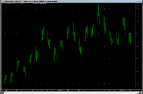
into much more informative charts, like this: 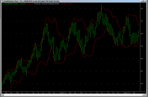
or this: 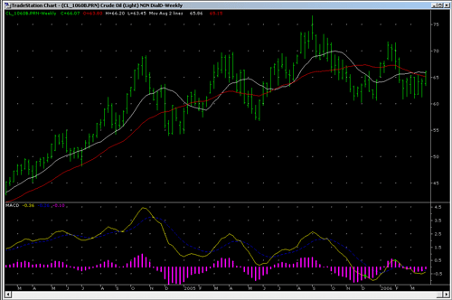
Ok, I can hear you screaming already. What the hell IS all this stuff?
The first chart. That’s light crude. Aka, oil. When people talk about the price of oil? That’s what they’re talking about [ed: uhh, to be anal, they’re generally talking about WTI – West Texas Intermediate, but this is generally number 2]. That’s a weekly chart, of the last two years. So you can see why petrol’s so damn expensive these days. Just so you know.
The second chart is called Bollinger Bands. John Bollinger was just a dude. A smart dude, but we don’t have to talk about him to get the gist of this.
Basically, Bollinger Bands tell us how much the market movement is contracting, or expanding. See how the lines kinda get closer, and then suddenly, bang! the market takes off? Yeah. That’s what Bollinger Bands are really handy for.
So, we can look at the chart and say useful things. Interesting things. Like “Hmm, light crude is going to consolidate (ie, not jump around as much) a little more, then we’re going to get a strong directional move“.
This doesn’t tell you if it’s going up or down (we’ll get to that), but it’s still handy to know. It means “keep your emergency pants ready”
The third chart is MACD. This stands for Moving Average Convergence Divergence. *yawn* yeah, exactly.
It’s a bit complicated, but here’s the basic gist: it gets a bunch of moving averages together, and measures how much they changing relative to each other.
Moving Average? Just think “average”. It’s the same thing.
wt F ? Why the hell would we bother to do this? Who cares, I mean, really?
Stay with me here, I’ll explain, then you’ll go “ohhhh!”
Some of the lines are “faster” (ie, they react quicker to changes in the data). The difference bit is where we start subtracting, say, a fast average from a slow one. What does this give us? Ahh, see, that tells us how fast the market is changing. Ie, not direction (up or down) so much, although it does tell us that too, but how quickly it’s changing direction.
So, it gives us advance warning about when the market is changing direction. Sure, you get bad warnings from time to time. These are called (amongst other things) false breakouts, or false signals. These are a big problem. We’ll get back to that later. Of course, you know, if predicting the market was easy, we’d all be billionaires. Ho Ho.
Ok, so let’s explain MACD.
At the top, to help explain, I’ve put two moving averages, a red slow one (changes slowly), and a white fast one (changes quickly).
The MACD is at the bottom and it works like this:
The yellow line is the difference between the white and red one. See how the yellow one goes down when the white and red get closer together? Yep, that’s why.
The blue line (bit hard to see) is a smoothed out version of the yellow one.
The magenta bars are the difference (stay with me here) between the yellow and blue (so when the blue and yellow cross each other, see how the magenta also crosses the zero line? Yep, that’s it).
In other words. You can look at the squiggly lines at the bottom and see direction, and changes in direction, and also how much and fast the market is moving in that direction (by how high the magenta bars are).
Oooh, that’s gotta be useful, right? right? right?
Of course, you might be saying, I can look at the chart and see that anyway. Key thing is this – you can’t see the future, so, having these lines helps clarify what might be happening soon.
So, in short, let’s say things are going up. Ok, blah blah, buy buy, etc. Wouldn’t it be useful to know when things were going to start going down, so you could, I dunno, sell, before you lost all your money? Well, MACD helps with that. Because before things start going down, they have to stop going up. Yep. a big duh right there, but it’s important. MACD helps us to see when things are slowing, and where they might be going next. Yes, false breakouts happen a lot. We’ll get to that.
So now, ooh! Useful information. We can look at the third chart and say things like (put your best boffin voice on), “Hmm, light crude is currently trending downwards, very slightly, but it’s slowing and about to change” (see the yellow line tilting up? yep, that’s how. magenta is below zero, ie, downtrend. yellow is turning up, ie, the market is maybe starting to turn).
We wouldn’t say definitively that it’s in an uptrend until the yellow line at least crosses the blue (ie, the magenta bars will be above zero), because, har har, we have to draw the line somewhere.
So. With technical analysis, we can say a much more useful thing like “Oil has been dropping, a little, but it looks like it’s about to explode in one direction, and probably upwards“.
Which, since we know that petrol prices at the pump tend to follow light crude a little slower (oil companies are big, and slow), we can say “Expect prices to go up markedly in a couple of month or so“.
See? Wasn’t that helpful? Wasn’t that fun?
So, technical analysis is pretty cool.
Even cooler than TA is the bunch of algorithms that make it up, because then you can do all sorts of interesting measurements. The above is really just a taste.
Oooh, I like algorithms. Algorithms are my happy friend.
Ok, second thing: 
ooh! I can see you’re excited already.
Ok, maybe not.
So what’s so cool about this? Ahh! I’m glad you asked.
MOO. That’s what. Multi objective optimisation (last item on the contents)
STOP YAWNING!
Let me explain. When you’re trying to solve a problem. A real problem. An interesting problem, you typically have to try and satisfy more than one criteria at once.
For example. Let’s say you want to go out with the best boy in school. What do you do?
You don’t just want someone cute. You also want someone tall. With pretty eyes. And smarts. And a good kisser. And well dressed. And so on.
Each of these is an “objective“. Goal, criteria, call it what you like.
Either way, you want to try and get as many of these as possible.
Now, if you just wanted the tallest boy, that’s easy. Line them up, walk to the end of the line. Voila.
Ditto if you just want the cutest boy. Or the boy with the prettiest eyes.
Thing is though, you want all those things. So, you might settle for, say, the boy with the second prettiest eyes, if he was also the cutest. Or perhaps the second tallest, third cutest, fourth prettiest eyes, because he was the best option.
But really, how do you know what the best option is? You weigh all these things together, in your head, and decide.
That’s what Multi Objective Optimisation is.
Except, instead of “boys in your school”, think “boys in the known universe”, and instead of 5 criteria, think, say, 50.
Any real problem. The interesting ones, the ones worth solving, are like this.
These are the problems I work on. And yes, I love it.
So, an historical view of the entire field of MOO (queue jokes now) is gonna have a whole lot of really useful information, right?
Well, it does. So, what did I learn? I learnt:
a) that I’ve more or less worked my way through all the research in the field done during the 1980’s.
remember, I’m just sitting in a room thinking this stuff up as I go along. So really, this is pretty good going. It gets better
b) I’ve also figured out some of the more successful techniques from the 90’s and 00’s.
Which is nice
c) also, there lots and lots of nifty cool interesting and successful other techniques for me to try out
All in all, a pretty damn interesting read.
So, so, so. Why the two of these together? Well, it’s like this.
What about if you got the computer to put algorithms together, with multiple objectives?
You could say things like “make me a moving average that reacts quickly, but doesn’t give me false breakouts“
or maybe “tell me which way the trend is going, but make less mistakes than MACD does“
or perhaps “tell me when the market is slowing down and about to change direction” – which is a good time to get out of a trade. Of course, the catch is, if the market slows, but then takes off in the same direction, you’ve just left a lot of money on the table. This is what us professionals call “Bad”.
With TA + MOO, anything you can dream of, anything you can think up, you could get it to do. Or at least have a damn good crack at.

Think Transformers here. Think Optimus Prime on steroids. Think infinitely flexible, infinitely expandable, infinitely connectable.
Yeah, kick ass.
So, you can see. This is pretty damn exciting. It’s kinda magical, really. There’s the possibility to come up with some pretty darn gnarly new stuff.
This is as much fun as a handful of kittens.. dropped in the middle of a knitting basket.
This is pretty much like getting an email that starts out:
Dear Sir
You have been selected from millions of people on our lists..
to tour our Giant Fire Breathing Robot Squid Factory.
I mean really, what more could a guy like me ask for?